Had being the operative word. Because today, this popped out of nowhere: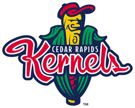 Why? Here's why.
“We feel this logo is a good representation of the Kernels and helps to bring home the fun we have here at Veterans Memorial Stadium every game”, said Jack Roeder, Kernels General Manager. “We are very proud of our classic logo but felt as an organization it was time to move forward.”Nothing says fun like an anthropomorphic bat dressed up as a cob of corn.
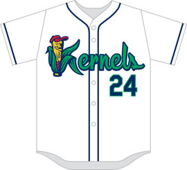
I do like the home uniforms though.
Right now, it's a push. The logo will probably grow on me. Maybe eye high by the Fourth of July.
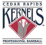
Most stuff taken from www.kernels.com. Except for the old logo. Which is only to be found HERE on their main site.
No comments:
Post a Comment